I ain’t gonna take it no more.
I ain’t gonna take it no more.
I ain’t gonna stand idly by while the bridal reply of a marriage of styles is
“Yeah, but what’s their demographic?”
I ain’t gonna take it no more.
I ain’t gonna take it no more.
I ain’t gonna stand idly by with a tut and a sigh while inside we all cry out for something new.
I ain’t gonna take it no more.
I ain’t gonna take it no more.
Soulless music, artless lyrics.
Goalless movements, heartless gimmicks.
Controlled and clueless, careers lasting a minute.
If this is the big life, well I ain’t lookin’ to live it.
We ain’t pushing the boundaries, we’re blowing them up.
We ain’t trying to expand the scene, we want the scene to erupt.
So make some room on the floor and somebody bolt the doors cos tonight. we ain’t seeking applause.
Tonight… Well, gee,
we’re just looking to have some good new-fashioned fun, y’all.
The Beat that my Heart Skipped, Dan Le Sac Vs Scroobius Pip (2008)
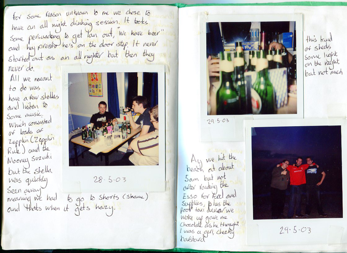
I have always had a passion for books, but my love of photography books as objects didn’t happen till late in my photographic education. Like many students we were made to do an artist’s book unit in our first year at Falmouth, however along with many other things that I am still resentful for, this was so poorly explained and managed that I took no enjoyment from it. This is the one and only time I have ever been failed for a unit and forced to redo the whole thing. I made a notebook journal, filled with polaroids of my mates and I getting “pissed up”, these were held in place with cellotape and interspersed with my memories of the period, in the form of diary entries. Now a days I could contextualise this with endless examples of the DIY aesthetic, but at the time I was clueless and angry with being held back by stupid briefs (time). I was going to refuse to play their version of the twee craft artist book.
Simon’s Diary May 2003 (or until the money runs out)I wish I could afford scampi, Diary detail (2003)all night drinking, Diary detail (2003)
The version of the book that I had to make to pass, was 24hrs on the beach in one spot, housed in a book made of toweling, with decorative hand marbled end papers, all housed in a canvas toe bag. I still keep both to remind me to stick to my guns, however originally I kept it to remind me not to eff up again and play the game. The version I was forced to produce is horrific and I’m still angry about it
Simon Robinson, Time, Tote and toweling cover (2003)Simon Robinson, Time, marbled end paper (2003)Simon Robinson, Time, (2003)
With the element of hindsight the original is far closer to my eventual aesthetic than I ever knew at the time. Scanning it’s pages it reads like a proto-version of this blog, but with more teen angst and misguided pathos. It captured a moment in my life when I came very close to dropping out and wasn’t coping with uni. the final page “the first of many” was taken at the end of my first year, and within a month half of the people in the images wouldn’t talk to one another ever again, bearing grudges that stand to this day.
The first of many, Diary detail (2003)
My passion didn’t kick in until my MA at Rochester, and it was down to two events. The first being the publications of the history of the Photobook Volume 1 & 2, which for the first time allowed me to see the scope of the field.
The second was the V&A’s Blood on Paper exhibition
The incredible catalog is still one of my most prized books, and at the time as a poor student was a hard purchase to justify, due to it’s price.
Blood on Paper (2006)
From the moment I walked into the darkened space to be confronted by the range of publications, I Knew I was in love, it was the beat that my heart skipped, like the moment I developed my first photo, or seeing Thomas Struth’s images at the Met. The floor opened up and suddenly I could see the potential of the subject, photography wasn’t about prints on the wall, it was about audience, curation, and spectacle. Ever since that point I have made book dummies and encouraged my students to think about the presentation of their work, how its intentions change dependent on it’s publication outcomes.
I feel slightly odd writing this post because it goes into things that I have barely discussed with my supervisors except in passing. They are well aware that I was offered two studentships at two very different universities, each involved working out of two differing research clusters and approaching the thesis in differing but interconnected ways. The one I accepted was the AHRC funding at LCC, working out of the Photography and Archive Research Centre, somewhere that with hindsight is the perfect fit, however at the time it was more difficult decision. The other was UCA Farnham’s BookRoom cluster, and since I turned it down, my potential supervisor, whom I felt I had built the start of a rapport with, hasn’t spoken to me.
Before this point however I spent two years working with Norwich University of the Arts on designing the thesis as a joint body of work between my wife and myself, joint bodies of practice with linked thesis, based on a research methodology from theater research where the outcome will always be collaborative. I am in debt to my wife’s input throughout the entire process, I have stolen countless ideas from conversations we have had and never fully thank her for them.
The two things that this work was always supposed to be was collaborative and book based. However during the last year this hasn’t really been discussed, except for briefly wanting to one day roll the project out as a wider commission, which Val wisely pointed out to me was for way in the future.
Hopefully by putting these intentions on paper it will force me to move them forward. Until I started writing this blog I never considered myself to be much of a writer, however I am increasingly becoming more comfortable with my written voice. Val is pushing me to find a way that these blog posts can become a tangible object. We had discussed using them as the basis for a show at PARC, hopefully in Feb/March 2015, mixing my words, images, videos, and sound recordings. I am incredibly excited by the possibility of this, but an exhibition is still an ephemeral item, you can’t hold it, or own it, to look at and explore in your old time.
My intentions for the work have always been wider than I am able to produce in the current time frame. The blog allows me to bring together and share all the sources that inform my work, but I, like many people actually find it very hard to read and absorb information from a screen, instead printing all my PDFs so I can read them at a later time, making notes etc. I obviously have always intended to produce a series of artist books for each region within my work, but I would also like to produce a series of publications that bring together my work, with that of others working in the field of urbanism.
The single most important invention of the second millennia was Johannes Gutenberg’s printing press. The moment the written word stopped being the domain of the state and church, and was open to the masses is the day that activism started.
How can you think freely in the shadow of a chapel, Situationist graffiti (1968)
The birth of psychogeography as an idea can be traced back to Guy Debord, and the Situationists International movement. An organisation born out of surrealism and the avant-garde movement, whose aims were to challenge the Marxist notion of capitalism and replace the bourgeois nature of western society. Like all good anarchic left wing organisations they were keen publishers of journals as a means to disseminate their manifesto.
The first use of the term psychogeography can be traced back to Potlatch #1 (which ran for 27 issues), of which 50 copies where printed and circulated as gifts. However it was not until the Situationists published their own journal that a coherent idea emerged. International Situationiste published a glossary of terms;
Internationale Situationniste No 4
Situationist
Having to do with the theory or practical activity of constructing situations. A member of the Situationist International.
Situationism
A meaningless term improperly derived from the above. There is no such thing as Situationism, which would mean a doctrine of interpretation of existing facts. The notion of Situationism is obviously devised by anti-Situationists.
Psychogeography
The study of the specific effects of the geographical environment, consciously organised or not, on the emotions and behaviours of individuals.
Psychogeographical
Relating to psychogeography. That which manifests the geographical environment’s direct emotional effects.
Psychogeographer
One who explores and reports on the psychogeographical phenomena
Dérive
A mode of experimental behaviour linked to the conditions of urban society: a technique of transient passage through varied ambiances. Also used to designate a specific period of continuous deriving.
Unitary Urbanism
The theory of the combined use of arts and techniques for the integral construction of a milieu in dynamic relation to the experiments in behaviour.
Détournment
Short for: détournment of pre-existing aesthetic elements. The integration of present or past artistic production into a superior construction of a milieu. In the sense there can be no Situationist painting or music, but only a situations use of the means. In a more primitives sense détournment within the old cultural sphere is a method of propaganda, a method that testifies to the wearing out and loss of importance of those spheres.
Minor Détournment
An element which has no importance in itself and which draws all it’s meaning from the new context in which it has been placed. For example, a press clipping, a neutral phrase, a commonplace photograph.
I am very aware as I proofread this that it has become very heavy, very quickly. The point I’m trying to make is like all subversive political movements the journal or pamphlet is the key method of dissemination. The Situationist International’s methods had a huge influence in counter culture movements in the proceeding years. Especially in the anti establishment politics of Oz or the punk movement, when the zine took hold, with its anarchic content and cheap cut and paste content, every page dripping with anger and resentment at the old guard.
Oz Magazine
On the pages of John Savage’s London’s Outrage (1976),
London’s Outrage No 2 Cover, Jon SavageLondon’s Outrage No 2, Jon SavageSame Thing day after day, London’s Outrage No 2, Jon Savage
and Linder Sterling’s Secret Public,
The Secret Public, Linda SterlingThe Secret Public, Linda Sterling
Audience were introduced to left wing politics, trade unions and feminism. While I have never enjoyed the aesthetics or sounds of the punk era, I can’t help be appreciative of their energy, and content. Savage’s images were recently shown at Tate Britain as part of the Ruin Lust (2014) exhibition, here they were shown out of context with no text linking them to their past use.
Uninhabited London, Jon Savage (1977-2008)
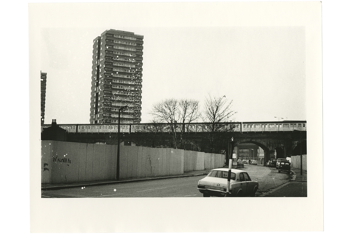
These photos were taken on an old Pentax during January 1977: their purpose was to serve as an image bank for the second issue of the fanzine London’s Outrage. The location was the square of North Kensington that lies between Holland Park Road, the Shepherd’s Bush spur, Westbourne Park Road and the Harrow Road.
Uninhabited London, Jon Savage (1977-2008)
The bulk of the images come from the streets around Latimer Road and Lancaster Road: the district called Notting Dale. Here, as in other inner London areas like W9 (the Chippenham) and WC2 (Covent Garden), the tide of industry and humanity had temporarily receded. Slum housing stock had been demolished, but there was no reconstruction: squatting communities like Frestonia (based in Notting Dale’s Freston Road) occupied the remaining buildings. Not yet the clichés of punk iconography, large tower blocks loomed like primitive monsters above the rubble and the corrugated iron. I was guided to this area after seeing the Clash and the Sex Pistols. I was very taken with the Clash, partly because their North Kensington manor was so close to mine. Songs like “How Can I Understand The Flies” and “London’s Burning” reflected their environment with precision and passion. London was very poor in the late seventies. The Clash and the Sex Pistols – the guttersnipes and the flowers in the dustbin – spoke of the human cost. This focus on the forgotten parts of the city was part of the social realism that would soon swallow punk. There was, however, something futuristic in this desolate landscape. The landscape that had been cleared to allow the Westway’s serpentine path opened up a gap that allowed imaginative and physical space. By 1976, the ideas contained in J.G.Ballard’s “Crash” and “High Rise” were like spores in the wind.
Uninhabited London, Jon Savage (1977-2008)
Like the dub reggae that saturated parts of West London, early Clash songs like ‘How Can I Understand The Flies’, with their instrumental drop-out, incorporated these gaps into their very fabric. The hyper-speed velocity of the Clash’s early live shows were, in part, an indication of the energy that came from seeing London’s dereliction as an opportunity: the forgotten city as playground. These areas are unrecognisable today. There are dwellings, theme pubs, smart media offices, cars, a new leisure centre. This regeneration is better, surely, than the blasted landscape of 30 years ago. But there was a kind of freedom in London’s spaces: before it became trapped in mass media definitions and music industry marketing, Punk offered a way of envisioning the metropolis anew, of redrawing its mental and physical map, that is now impossible.
Jon Savage
Uninhabited London, Jon Savage (1977-2008)
The aesthetic and sentiment of the punk era has found it ways into many psychogeographic publications of the post punk era, whether in the work of Tom Vague’s Vague, later Vague: Psychic Terrorism Annual. Arguably the best of the early eighties post punk scenes, Vague was a major work.
London Psychogeography: Rachman Riots and Rillington Place, Vague (1988)
It was thick, well bound and full of massive sprawling articles on pre fame Adam And The Ants, the proto Goth scene, squatting, anarchism, Apocolpyse Now and long road stories, it felt radical and editor Tom Vague was bang in the middle of an emerging subculture that would soon be mislabeled Goth, he was there at a time when it was radical and thrilling and reflected it in his superb writing. It would later include a heavy psychogeographic element with important issues such as ‘Rachman Riots and Rillington Place’, an episodic treatment of certain key moment in the recent history of Nothing Hill.
On the face of it Vague’s treatment of history is conventional to the point of barbaric idiocy: his use of a timeline to structure the narrative can hardly be called sophisticated and his refusal to interpret events or people psychologically or sociologically would be below most hystoriographers.
Almost all history is written by dinosaurs but Vague is of the 1-2-3-GO! school and the result, raw and elementary, creates a lot of space for your own associations, relevant knowledge and mental garbage to fill the gaps. In the context of psychogeography Vague is moving in the opposite direction of most psychogeo writers. Instead of writing about a spatial entity from the perspective of the individual (place and space presented as malformed after a rollercoaster ride through the maelstrom of the personal madness and deep emotions of a very special person (as, you are aware, all writers (boring fucks) are)). If you read carefully – the last page gives the biggest clue – Vague presents this almost as the autobiography of Nothing Hill with him as the inspired mouthpiece, his own biography mixed with that of the subject. He is the place.
Cryptoforestry Inner City Reforestation in Utrecht and the G/Local Amazon; Psychogeography is involved. (2011)
I first came across the work of Laura Oldfield Ford in the sterile pages of Blueprint, just like Savage’s work finding a new home in the gallery setting, it was neutered of it’s original intentions and it was difficult to think of her as more than an interloper in other peoples lives. The gallery is now her primary method of dissemination, but her intentions of the work remain the same, “psychogeography has become a depolitical bourgeois activity, thanks to Will Self and cohorts, I want to return it to a Situationist perspective, a stringent urban critique, a method of geopolitical interrogation.”
Wapping, Laura Oldfield FordBrutalist Estate, Laura Oldfield Ford
Born in Halifax as the textiles industry was being ripped apart by Conservative Britain, she became involved in the early 90s squatting and rave scene, of the kind depicted by Tom Hunter in Le Crowbar (2013), far removed from the hysteria I remember growing up in the M25 belt, depicted luridly in the local news.
The Total Resistance soundsystem, Tom Hunter, Le Crowbar (2013)
It would be in the Pages of her zine Savage Messiah (2005-09) that she would find an outlet for her anger at London’s gentrification and community alienation. Each issue would focus on a different London postcode.
Savage Messiah cover, Laura Oldfield Ford
In 2008 Owen Hatherley named Savage Messiah 10: Abandoned London as one of his “books of the year”, describing it as “an oneiric vision of a depopulated, post-catastrophe capital, pieced together from snatched conversations and reminiscences, set in a landscape of the labyrinthine ruins of 1960s architecture and today’s negative-equity banlieue. (French suburb, or increasingly American style housing ‘Project’”In 2011, Hari Kunzru listed Verso Books’s publication of Savage Messiah in book form as a “book of the year” and described it as “a wake-up call to anyone who can only see modern cities through the lens of gentrification.” In a 2013 review for the American Book Review, Sukhdev Sandhu described the Verso publication as an example of “invisible literature” and “avant-pulp psychogeography” able “to rekindle erased histories of popular dissent from the 1970s to the 1990s”, and one relevant to “a new and possibly endless age of austerity”
Savage Messiah detail, Laura Oldfield FordSavage Messiah detail, Laura Oldfield Ford
Laura Oldfield Ford’s samizdat pamphlets, recording moody expeditions, pub crawls, mooches through the kingdom of the dead that is liminal London. Even the author’s name seemed like a serendipitous marriage of Blake’s Old Ford and the poet Charles Olson’s notion of open-field poetics (the contrary of the current fetish for enclosures). The original Savage Messiah “zines” are serial diaries of ranting and posing among ruins. Ford delivers the prose equivalent of a photo-romance in quest of a savage messiah with attitude, cheekbones and wolverine eyes. A feral, leather-jacketed manifestation of place.
Collided into a great block, the catalogue of urban rambles takes on a new identity as a fractured novel of the city. Slim pamphlets, now curated and glossily repackaged, have an awkward relationship with their guerrilla source. With a formal introduction and a cover price a penny short of £20, it is difficult to sustain the swagger of the throwaway form, strategically manipulated to look like dirty sheets on which you can smell the ink, glue, semen and toxic mud. The structure depends on a steady drip-feed of quotes from JG Ballard, Italo Calvino, Guy Debord, Walter Benjamin. White men all, festering in elective suburbs of hell, where they labour to finesse a paradise park of language.
Bristol Zine, Laura Oldfield Ford (reminiscent of Jon Savage)Uninhabited London, Jon Savage (1977-2008)
Moving beyond this relentless Xeroxing of the entire genealogy of protest from Blast to Sniffin’ Glue, by way of Situationism and psychogeography, Oldfield Ford displays authentic gifts as a recorder and mapper of terrain. She is a necessary kind of writer, smart enough to bring document and poetry together in a scissors-and-paste, post-authorial form. Like so many before her, psychotic or inspired, she trudges far enough to dissolve ego and to identify with the non-spaces into which she is voyaging. “This unknown territory has become my biography.” Her story is eroticised by the prospect of riot, anecdotes teased from smouldering industrial relics. The “euphoric levitation” of brutalist tower blocks. Post-coital reveries from “an ugly night on ketamine in a New Cross squat”.
Savage Messiah by Laura Oldfield Ford – review, An inspired collection of urban rambles, The Guardian (2011)
Technology has moved us away from the cut and paste photocopy zine of punk and post punk eras. The development of digital offset printing as seen a resurgence in indie publishing, in a myriad of forms. Once again the medium has been liberated from the bourgeois and is been used by the everyday to tell their own stories. A new generation is combining digital technology with the traditional craft of the artist’s book as a means to produce mass produced publications. Old technologies, such as Risographs, originally designed as a cheap duplicator for churches, schools and prisons, and vintage printing presses, have been re-appropriated from second hand sales, leading to re-embracing of the arts and craft studio, pioneered by Morris, Burne-Jones and Ruskin.
Risograph Printer, Ditto Press
One of these new breed of studios and publishing imprints is Ditto, speaking here in the British Journal Of Photography about the formation of their business.
The duo spent the next two months sourcing equipment, much of which was bought second-hand. Central to there plan was the Risograph – a high-speed digital printing system that was launched by the Riso Kagaku Corporation in 1986, but at the time gained little traction in the photography or creative industries.
We were the first company in the country to use it. There was a company in Holland printing on them for about 15 years, a company in Switzerland using them to print their own books, and a guy in America who was a fan, but when we started, if you Googled Risograph you wouldn’t find much.
We came upon it at the right time – the credit crunch meant paper companies shut down; printing companies shut down and budgets disappeared. If someone did a graduation show, the budget for the catalogue used to be £15,000 and people would sponsor it. Suddenly because of the electronic printing revolution, the economic slowdown and the printing industry dying, budgets were more like £3000-4000. Students and galleries don’t have huge amounts of money to spend on printing collateral any more.
Enter this print process, where you can print fluorescent pink on beautiful paper for £50, and suddenly everyone wanted to use it because there were no options, other than digital that looks kind of soulless…
Herschel Telescope, Ditto Press
It obviously doesn’t suit everything, if you want photos to look crystal clear, then digital or offset printing is the best way to do it. Where it works best is when people think, ‘OK, this is how the process looks, I’ll design a book to make the most of that process.’
If you where to now Google Risograph you would find a multitude of Studios/Collective/Imprints/Presses using the technology, Hato, Two Press, Bolt, Victory Press, etc.
At the other end of the craft spectrum are collectives, buying up and reusing moveable type. The London Centre for Book Arts (LCBA) is an open-access educational and resource centre dedicated to book arts. Based in what was once the heart of London’s print industry in Fish Island, close to Hackney Wick in east London, LCBA fosters and promotes artists working in book form and self-publishing. They offer access to specialist printing and binding facilities, and run workshops on a variety of subjects related to book arts. As well as encourage collaboration and dialogue, and running an exhibition programme highlighting work being done regionally and beyond.
While these facilities have been available for years at our specialist art colleges, London College of Communication, Camberwell College of Art, UCA Farnham’s BookRoom Cluster and the University of West England’s Book Arts at the Centre for Fine Print Research. This is the first major resource that anybody can access on a membership basis.
The BookRoom space
Some people travel the US to see the sights and bright lights, to maybe lose themselves in the kitsch of Vegas or Hollywood’s craziness. Simon Goode, on the other hand, roamed the country to explore the joys of papermaking, typesetting and bookbinding.
“The trip was like a holy grail,” he said, rhapsodising over three months travelling from New York to Los Angeles on a mission that has helped result in Britain’s first ever centre for a craft that is in danger of disappearing: book arts.
That term may be a mystery to some. “It is a difficult one to define and still, to this day, a lot of people don’t know exactly how to define it,” admits Goode.
Essentially, it is creating art in book form. “Then you’ve got the question, what is a book?” he added. “My experiences define it as using traditional techniques, like bookbinding and letterpress making – but not wholly, and not exclusively – for artists to produce their own works.”
If that’s still fuzzy, then Goode hopes people might just come along to his centre to explore an art form whose practitioners have included Richard Long, David Hockney and Ed Ruscha, whose first artist’s book was Twenty-Six Gasoline Stations, which featured 26 photographs of just that. In the UK, the largest number of artists’ books is held by the V&A, while Tate has about 5,500.
Goode said it was something of an anomaly in the UK that while there has been no centre until now, there are plenty of artists’ book fairs and shops where the books are sold.
That’s not the case in the US, where the first book arts centre opened in New York 38 years ago, with others following in cities such as Chicago, Minneapolis, Portland, Los Angeles and San Francisco.
Goode said his trip to the US “visiting these incredible institutions” was a complete eye-opener and that it was these experiences which led him to create the London Centre for Book Arts in a 365-square metre space in Fish Island, Hackney, which has been funded by membership fees and benefactors.
Clive Phillpot, a former director of the Museum of Modern Art’s library in New York, said it was “remarkable that a capital city such as London has not previously had a specific centre for book arts”.
Goode’s mission has been driven by his experiences when he graduated from his book arts course – now earmarked for closure (since closed)– at the London College of Communication (formerly the London College of Printing) in 2006.
“I soon found out there was nowhere for me to use all these bits of specialised equipment that I’d learned. I spent three years learning all these bookbinding and printmaking techniques, it was amazing and I had a brilliant time and I wanted to carry on, but there was simply no access,” he said.
“Unless you can afford to buy all your own equipment, and you’ve got a living room with reinforced floors, there’s no way of doing it.”
It took two weeks to move in the specialist equipment that Goode had been accumulating and storing in garages over the years, including an impressively intimidating Victorian guillotine once owned by Ted Hughes, who used it for his own small press publications. That has been donated by the University of the West of England in Bristol, while a wooden press from 1897 comes from a former printer in Birmingham who sold it ridiculously cheap so it went to a good home.
“It is a little bit dangerous, which is why it’s chained up at the moment,” said Goode. “It’s not for use by anyone other than myself really. It looks nice though – and it does work.”
Simon Goodge, London Centre for Book Arts
Goode opens the centre later this month and hopes to have about 2,000 people through the doors in its first year.
The opening has been welcomed by people in the book arts world. Sarah Bodman, senior research fellow for artists’ books at the University of the West of England’s centre for fine print research, said the UK needed to establish something similar to the American example.
“The UK needs a model like this to open and support the creative economy and help artists to produce book works, build upon their skills and network with their peers,” she said.
New chapter opens with Britain’s first centre for book arts, The Guardian (2013)
Last Days of W, Alec Soth (2008)
Another sector of the indie print industry that is flourishing is newsprint, used for several years by photographers like Alec Soth, Last Days of W, (2008) and his series LBM Dispatch, which is now embarking on its final journey through the state of Georgia USA. Since it’s inception in 2012 with Ohio.
LBM Dispatch #4: Three Valleys, Alec Soth and Brad Zellar (2013)LBM Dispatch, Alec Soth and Brad Zellar (2013)
The LBM Dispatch is an irregularly published newspaper of the North American ramblings of photographer Alec Soth and writer Brad Zellar. Over the course of one week in May 2012, Alec Soth & Brad Zellar visited a dozen towns and cities throughout Ohio in search of community life, and along the way recorded the faces and voices of people longing to connect with their neighbors. This newspaper was published one week after Soth & Zellar returned from Ohio.
LBM Dispatch, Alec Soth and Brad Zellar (2013)
I didn’t want a big book so I decided to self publish it as a newspaper. It was a goof, and I ended up having a lot of fun with it. LBM (Little Brown Mushroom) is a lemonade stand and, with each project, I want to keep that in mind. If it gets too serious, if it becomes a business or a job, then I want to back off. My goal is not to get too serious – to break even, not to grow, not to make money.
Alec Soth
The UK company Newspaper Club has created a business that allows people to easily produce newspapers in arrange of sizes and page numbers. A quick look at their blog shows how readily the creative industries have taken to the throw away medium.
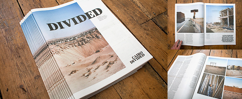
Photographers are choosing newsprint for a number of reasons, Soth spoke of liking the non archival quality of the newsprint. “In 40 years from now, I want to pull out an old yellow copy and show it to my grandchildren and say, ‘I published this at the end of George Bush’s presidency’.” Jason larkin chose it for the unfinished feel, and to complement the Subject of Cairo Divided, a city in a state of flux. The decision was also born out of the frustration of how the main stream press were treating photo journalism, a two year project would be condensed to six pages.
Cairo Divided, Jason Larkin (2011)
“It’s a reality of the marketplace, but I was very interested in expanding the project in terms of the number of pages, and also the size of these pages. I wanted to be able to print the landscapes big. When you open up a newspaper you realise there’s quite a lot of space there.” Jason Larkin
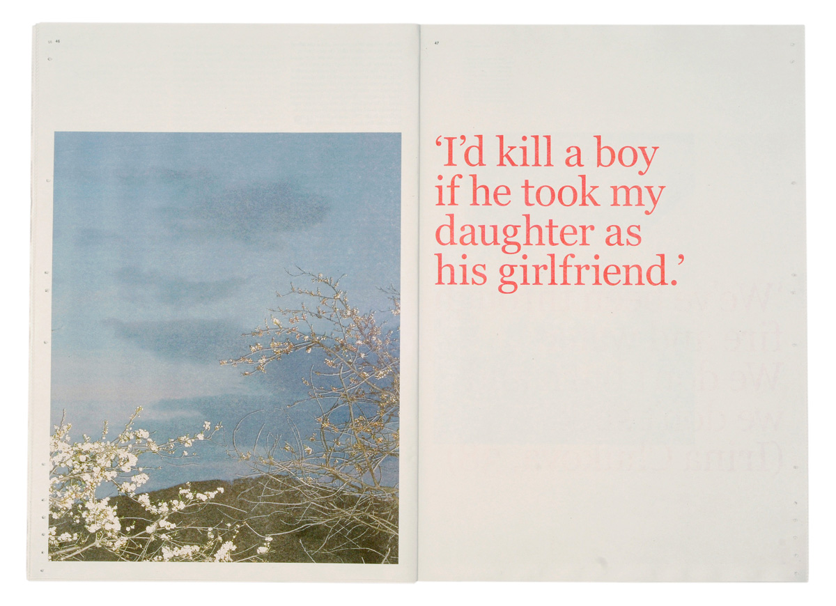
Rob Hornstra of The Sochi Project talks of the versatility and audience that a newspaper can encompass.
It was a very small story, so it just didn’t feel right to print it in a photobook. We wanted to be able to distribute this newspaper in different places across Europe and for different purposes. Sometimes the newspaper would act as a catalogue for the exhibition, other times we would just distribute it to people on the streets, and in some cases it acted as the exhibition itself, pinned to the wall. So the designers and myself made the decision to create assort of multifunctional newspaper…
On the Other Side of the Mountain, Rob Hornstra (2010)On the Other Side of the Mountain, Rob Hornstra (2010)
Printing newspaper is a brilliant way to get a story out. If you use newsprint you can give it away for free. Of course you can charge for it, but that’s really stupid…
If you do a photobook, your story won’t be seen by many people. With Newspaper, you can spread it round…
On the Other Side of the Mountain, Rob Hornstra (2010)
In Japan, they are producing some really beautiful newspapers that are really different from what we expect newspapers to look like. That’s the problem we’re facing, people are still thinking about the idea of it being an actual newspaper. You shouldn’t. You should think about it as a series of pages with which you can do whatever you want. Most newspapers I’ve seen are still fairly conservative. But you can turn it in all directions; readers can create their own layout and sequence. You can fold it in two or in four. You can print across several spreads to make a poster. We can learn a lot about it from the Japanese market. I think it will be very interesting to see how it’s used in the future.
Rob Hornstra
On the Other Side of the Mountain, Rob Hornstra (2010)
The importance of the Japanese photobook cannot be underplayed, for many this was a closed community, little known outside of it’s country of origin or very specialist collectors. It wasn’t unit Badger and Parr dedicated a chapter of their seminal History of the Photobook Vol 1 (2004) that the art community as a whole was able to get their introduction to it. It is unsurprising that a culture that holds craft in such reverie that craftsman can be certified as Living National Treasures by the Ministry of Education, Culture, Sports, Science and Technology, should embrace that photobook as the primary medium of displaying work.
Japan in the 1960s and early 70s marks a highpoint in the history of the photobook, another of those briefs periods, like Russia in the 1930s, when photographic book publishing was at the forefront of the cultural renaissance that touched all the arts. The iconoclastic photo-magazine Provoke had a vital influence on Japanese photography and all the Japanese photobook. It was an influence that one might contend, that was out of all proportions to the mere three issues published during its short, hectic existence.
History of the Photobook Vol 1, Badger & Parr (2004)
Provoke
Provoke (Purovōku) was an experimental magazine founded by photographers Yutaka Takanashi and Takuma Nakahira, critic Koji Taki, and writer Takahiko Okada in 1968. The magazine’s subtitle read as: shisō no tame no chōhatsuteki shiryō (Provocative documents for the sake of thought). Photographer Daido Moriyama is most often associated with the publication, but Moriyama did not join the magazine until the second issue. Provoke lasted only three issues with a small print run, but remains an important cultural artifact of the postwar era.
Provoke 3
The magazine sought to be, in accordance with its namesake, a provocation to Japanese society and specifically its photographic culture, at the time mostly relegated to staid, European-style photojournalism and straightforward commercial photography. They sought to awaken and refresh the aesthetics of existing photography and question the increasingly commercial visual language of Japanese society following the havoc wreaked by war. Considering Provoke. Artist Dan Graham once saying of his conceptual magazine works, “I love magazines because they are like pop songs, easily disposable, dealing with momentary pleasures.”
Indeed, a strength of the magazine as medium is its very ephemerality and serial nature. It has the ability to capture the artist’s pure reaction and burning mood, and in the case of Provoke, a sort of subdued anti-commerciality following national tragedy. Magazines are rarely difficult to produce or consume and can be more widely circulated than other kinds of artwork. And because they are often produced in editions, the weight of a single issue isn’t as highly estimated in the artist or audience’s mind as a singular painting or sculpture might be. While Provoke is far from being considered disposable (now rare and highly collectible), it’s useful to consider these rudiments of magazine as conceptual medium in the case of Provoke and its legacy.
Provoke, page detail
One book by Daido Moriyama has gone down as a pinnacle in book making and takes the style that dominated the pages of Provoke to its logical conclusion. The aesthetic that came to define post-war Japanese art photography: saturated to the point of looking wet, content savagely abstracted, and forms leaden or hallucinatory. This are-bure-boke photographic style and the dark portrayal of post-war Japanese society lay in sharp contrast to the existing public imagery of the era.
In 1971 Moriyama tagged along with his friend Tadanori Yokoo on a trip to New York. This was Moryama’s first trip outside Japan, and the use of the images would lead to an improvised masterpiece of photobook making. Hiring a Tokyo shop/gallery in 1974, Moriyama would spend 14 days hand making a book Another Country in New York (1974) for people while they waited. In lieu of mounting photographic prints on the walls of the gallery, Moriyama brought in a photocopy machine and silk screen printing station. Using this equipment, he generated an ad hoc photobook composed of photocopied sheets staple-bound inside a silkscreen cover. Every day Moriyama would alter the books sequence depending on his mood.
Another Country in New York, Daido Moriyama (1974)
Since 74, Moriyama has restaged the show Printing Show (1974) twice. Once at the aperture gallery in 2011, entitled Printing Show – TKY,
Cover, Daido TKY, Daido Moriyami (2011)Page detail, Daido TKY, Daido Moriyami (2011)Page detail, Daido TKY, Daido Moriyami (2011)Screen printing the cover, Printing Show, Daido Moriyama, New York (2011)Page selection,Printing Show, Daido Moriyama, New York (2011)Selecting page edit, Printing Show, Daido Moriyama, New York (2011)Covers, Printing Show, Daido Moriyama, New York (2011)Stapling individual publications, Printing Show, Daido Moriyama, New York (2011)
And most recently at the Tate Modern in 2012 for the show William Klein + Daido Moriyama, working with the imprint GOLIGA that produces, edits, and publishes limited editions, experimental book works, and photography-based events. Goliga’s principal objective is to experiment with innovative ways of disseminating and engaging with photography. The resulting book was entitled Menu.
GOLIGA’s founder Ivan Vartanian describes the thought process around Printing Show. ‘I think the question of what a publisher is very interesting. Usually it’s about taking a body of work and putting it in a traditional book format for distribution. That is uninteresting for me. Im looking for that place where we can take the publishing process and make it as much as possible a clear reflection of the photographer’s empirical involvement with the book/object/thing/experience/dynamic/installation/moment as a work in itself – while simultaneously incorporating a distribution and sales model.
I also want to bring people together and have them actively engage with the work. I see the performance venue as a theatre, library, thinking space, communal area, and the province of the artist. That’s what these performances are about – being connected, being present. I see books as part archive, part documentation and part meta-process. The book itself has to be an outcome of the event process that it is documenting, but it is also a reflection of whatever we are making at the time. And that, I think, is ultimately what I’ve learnt from Japanese photobooks and Moriyama’s ‘Printing Show’. It is not a reproduction of something that happens somewhere at some point. The photobook in its reproduction and in its creation is an original. Even though there are 300 of them, each one is an original and is a reflection of the photography it contains. Everything that I’m doing now and everything that is embraced within printing show comes back to that one idea.
I wasn’t intelligent enough to attend Printing Show, at the time (and still a bit now) I don’t really enjoy are-bure-boke photography, and it seems cynical and perverse to buy a book you don’t like just for it’s design factors, it is too much of a move to fetishisation. However as a photographer I wish I could have experienced the audience’s reaction to the process. I
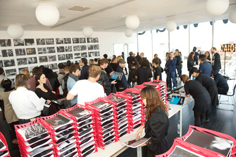
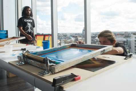
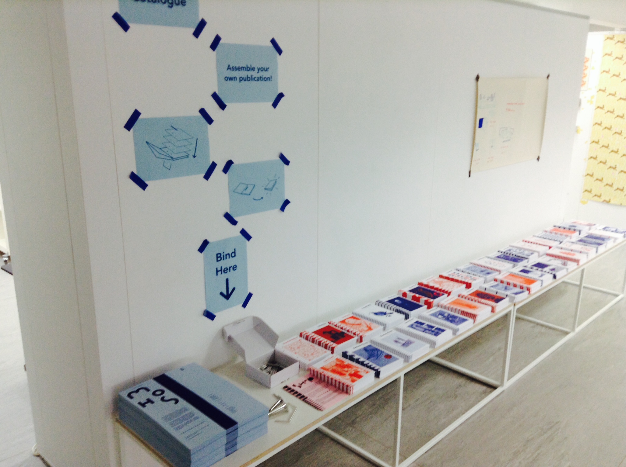
was able to recently experience the DIY book on a far smaller basis, in the form of the Norwich University of Arts, Illustration catalogue, which was presented as a self assembly station, with pre punched pages and simple binders. The students that I accompanied to the show thought I was mad, as I told them how great this was, but I enjoyed jostling with others to pick up the pages and assemble my edit, experience the work as a collective experience, instead of isolation.
Once we go back to university in September I intend to discuss how we can incorporate elements of the ideas above into the work. I am really hopeful that I can find a way to transfer the blog and wider research into an analogue object, that the audience can take away. Something that is in keeping with the DIY aesthetic of the situations, and is informed by the print heritage of psychogeography. And above all that allows me to incorporate into it, the words and images of my peers, either through pre-existing materials or as a call for ideas/content. If you have any thoughts please get in contact with me.


 The second was the V&A’s Blood on Paper exhibition